Back to blog
Why Radix Colors?
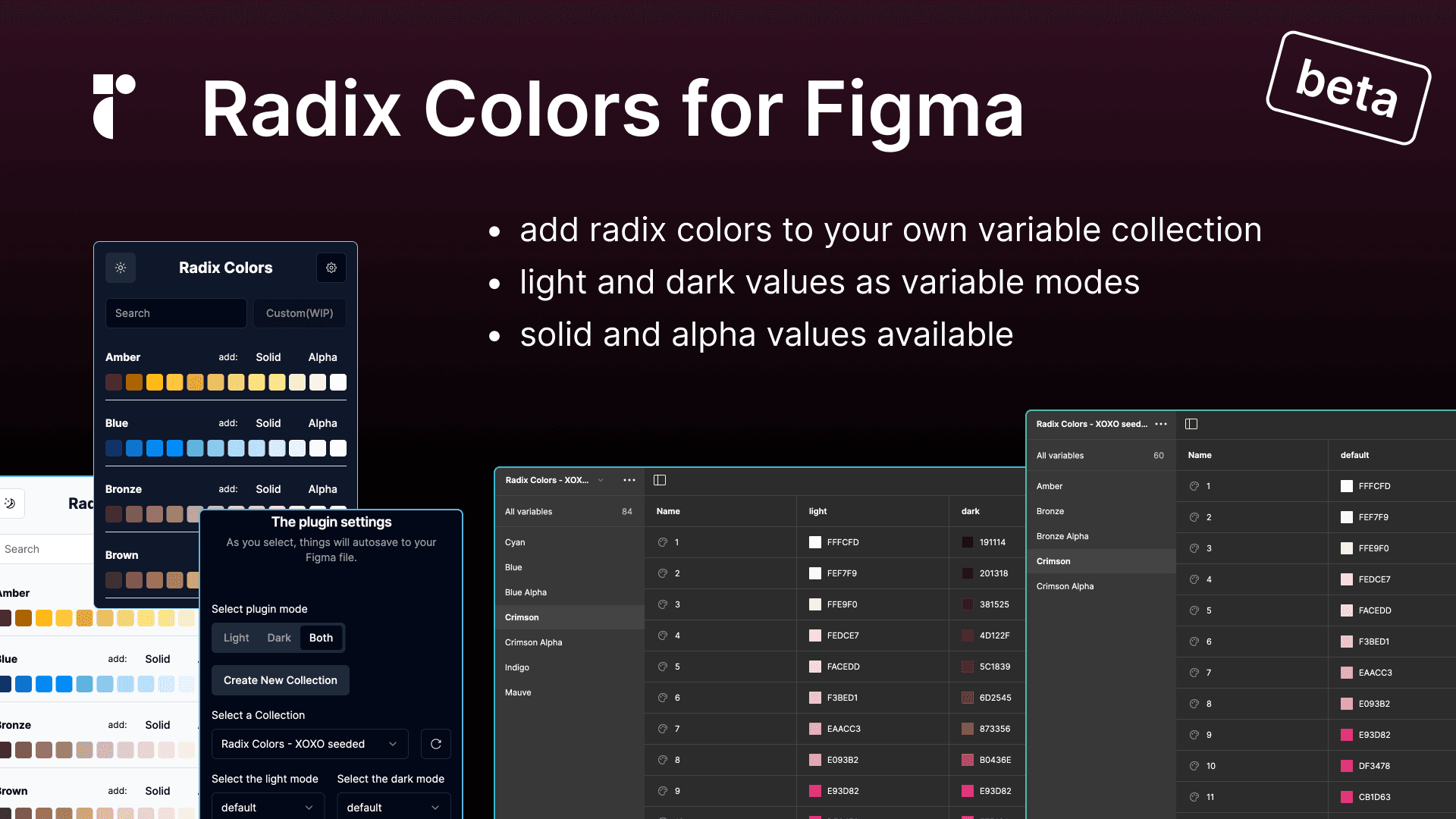
Simplify Your Design Workflow with Radix Colors and Figma Variables
Designing with color should be fun, not frustrating. But as projects grow, so do the challenges: documenting every shade, maintaining consistency, and implementing dark mode can all become massive time sinks. In this post, I'll show you how using Radix Colors with Figma Variables can bring structure and clarity to your color workflow, without limiting creativity.
Why a Color System Matters
Color decisions often live in the gap between design planing and implementation. You might have a team picking the perfect palette, but when it comes to implementation, things get murky:
- Which shades are for backgrounds, text, borders?
- How do we document where each color is used?
- How do we actually support dark mode without duplicating effort?
These decisions are often made by color or branding teams—but they don't always consider developer experience (DX). This can lead to confusion, inconsistency, and rework.
Radix Colors: A Better Starting Point
Radix Colors is a well-designed color system that solves many of these problems:
- Predefined scales for each color (12 steps per hue)
- Built-in support for light and dark mode
- Excellent documentation with usage guidelines
- same perceived luminosity across colors at the same shade level 🤯
- access to solid or alpha colors
- support for P3 colors
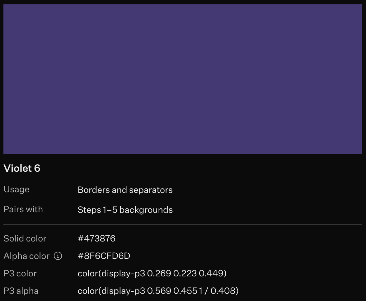
Did I mention it's also developer friendly? Radix takes the extra step of making color tokens intuitive to read and use in codebases. It's that rare balance where aesthetic decisions meet practical implementation. (More on this in the next post! 😄)
Using Figma Variables for Light/Dark Mode
Ok... but how do we get it going with Figma?
We built a Figma plugin based on the Radix source code that automagically (is this a word?) creates color variables in your file. No more copying and pasting frames or SVGs.
It pulls data directly from the real source (code), and gets you up and running with a consistent, scalable palette.
If you're using a paid Figma plan, you get access to Variable Modes. This powerful feature lets you define multiple values for the same token. Perfect for managing light and dark themes.
The plugin doesn't just drop color shades into your file. It generates a full set of variables with proper light/dark mode mappings for every shade. That means a true, production-ready palette with theme switching baked in.
So, instead of duplicating components or maintaining parallel frames for light and dark, you can:
- Apply color variables to a single frame or component
- Toggle between light and dark modes in just one click
Step-by-Step: Importing Radix Colors into Figma
Let me walk you through the process. Here's the most straightforward approach to implementing a comprehensive color system with light/dark mode support in Figma.
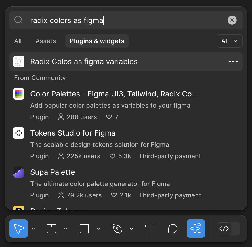
Step 1: Install and set-up the Plugin Radix Colors as variables
You can add this to any of your figma files. The process is untrisutive and reversible.
-
Open the design file where you want to use Radix colors
-
Open the plugin.
-
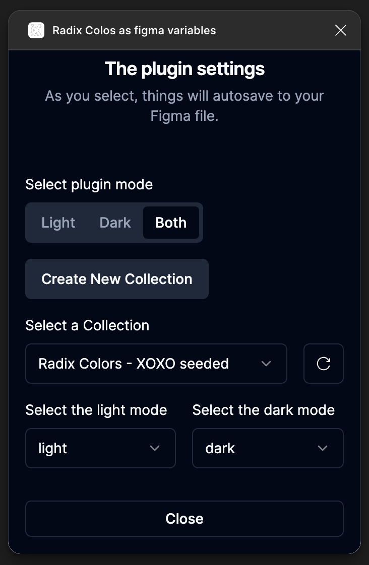
Perform a one time setup (click the cog icon):
-
The plugin allows you to create a new variable collection or use an existing one.
-
You get to choose if you use the light mode or dark mode or both. (Figma free plans only allows for a single mode, so we can't default to both.)
-
Settigns are saved as metadata to your local file.
Step 2: Generate Your Color Variables
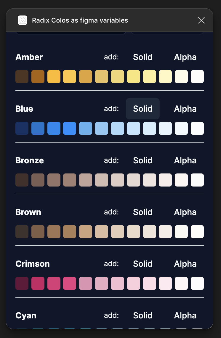
- click "Solid" or "Alpha" buttons to create a set of variables in your choosen collection.
💡 That's it. You now have a full set of color variables—light and dark values included—ready to use across your design system. No manual setup, no duplication.
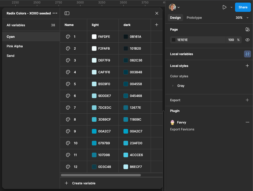
In order to open the variables, deselect anything in your file, and in the right sidebar you should see the Button next to the "Local Variables" label. Make sure you have the correct variables colelction selected in the top left menu of the variables view.
Example: Designing a Simple Card with Radix
Let's create a simple card component to see Radix + Figma Variables in action.
1. Card Background
- Create a rectangle (frame)
- Assign it a fill from the scale, e.g.,
1grayfor light mode1gray1
1Fill → Use Variable → Select "gray1"
♻️ When you toggle to dark mode,
will automatically map to its dark equivalent.1gray1
2. Border
- Add a stroke
- Set the stroke color to something like
1gray6
3. Text
- Add a text label (e.g., "Hello Radix")
- Set the text color to for maximum contrast
1gray12
📸 Image Placeholder: A side-by-side image of the same card in light and dark mode using variables Filename: card-light-dark.png
Bonus: Swap Entire Color Palettes in Seconds
One of the coolest things about Radix is that shade numbers are consistent across color scales.
So if you want to switch from gray to blue:
1gray1 → blue1
2gray6 → blue6
3gray12 → blue12
This lets you experiment with themes and accents without changing your structure.
Try this:
11. Open the Variables panel
22. Switch the assigned color from "Gray" to "Blue"
33. Watch the whole design update instantly
📸 Image Placeholder: GIF or screenshot showing a variable being swapped (e.g., gray1 → blue1) and the UI updating Filename: color-swap.gif
Final Thoughts
Combining Radix Colors with Figma Variables helps you:
- Stay consistent across design and code
- Build light and dark themes effortlessly
- Iterate quickly and confidently
This system scales beautifully—whether you're designing a landing page, a design system, or an entire product suite.
Resources
- 🔗 Radix Colors Documentation
- 🔗 Figma Variables Documentation
- 🔗 [Your Plugin Link Here] (add it once it's published!)
Thanks for reading! If you have questions or ideas for improvements, drop a comment or reach out.
Happy designing 🎨